One of Corymbus’ main concerns is to simplify the navigation in the screens as much as possible, so that the entry and consultation of information is as smooth as possible.
The data lists already offered a mechanism that allows you to click on a field to edit it directly. This speeds up the updating of a series of information.
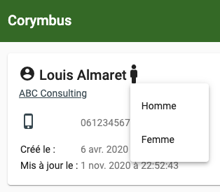
When you are in the view of a contact, company or other entity, you can now edit the information with a single click, for example to update a person’s first name, or indicate their gender (to personalize marketing campaigns later):

Note: To lighten the display, Corymbus does not usually display worthless fields. Therefore, to define a field that does not yet have a value, you have to go to the edit screen. The new fields that can be edited by a click are however useful for modifying an already defined data.
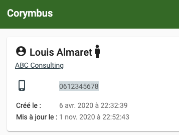
When you hover over a field with the mouse, the highlighted background tells you that it can be changed by clicking on it:

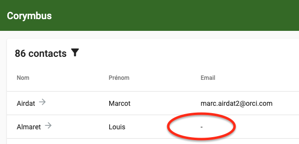
In the lists, the empty fields are now systematically represented by a dash, which allows you to click on them to enter their value, for example, here, the email address of Louis Almaret:

Still in the lists, the clickable fields (with an arrow to the right to consult the corresponding data, for example a contact or a company) offer in addition to the arrow, an edit button when they are hovered over by the mouse:

This button allows you to go directly to the data modification screen, rather than going through the display screen of this data, then clicking on the modification button.


